Publications
 Partners


Pink and blue are broadly categorised as female and male colours respectively, but society is fast transcending cultural and gender norms. Pantone’s recent, yet unusual announcement of, not one, but two colours set to dominate the pallets of every fashion, interior and visual artist in 2016 provides tranquil stability and reignites progression towards gender fluidity.
Leatrice Eiseman, executive director of the Pantone Colour Institute finds that there is a yearning for softer shades that offer relaxation and calmness, especially within such a diverse world struggling with identity.
Because we are submerged in fast-paced living and modern day stresses, Pantone finds that sophisticated consumers often seek mindfulness and well-being.
According to Pantone’s announcement, Rose Quartz and Serenity created to offer just that: Rose Quartz is persuasive, gentle and conveys compassion and composure while Serenity compares to the blue sky and provides relaxation and respite.
But can colour become a helpful medium in the journey of finding ourselves, or is this just ethereal bullshit?
Here’s some of what you can expect on the runways of 2016:
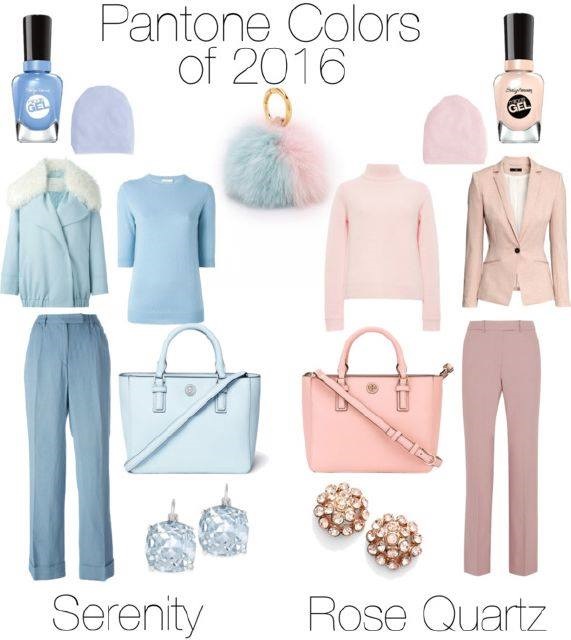
Image: Facebook
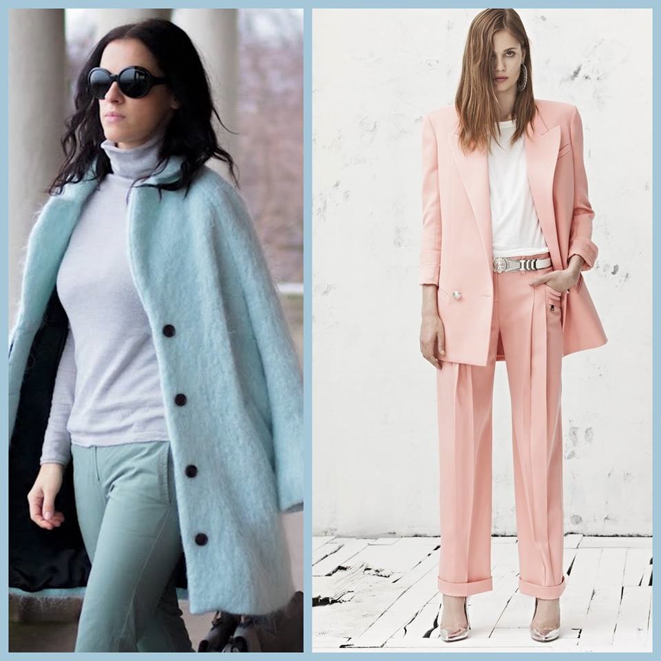
Image: Facebook
What does colour do for you and how do you express yourself through colour? Email us, we'd like to hear from you.
Follow Women24 on Twitter and like us on Facebook.