Publications
 Partners


Leatrice Eiseman, executive director of the Pantone Colour Institute finds that there is a yearning for softer shades that offer relaxation and calmness. She also says that colours transport us to a happier, more expressive state giving us the freedom to be exactly who we are.
Spending time at home is often the ideal chance to unwind from modern day stresses and reflect on what is becoming an increasingly a fast paced life.
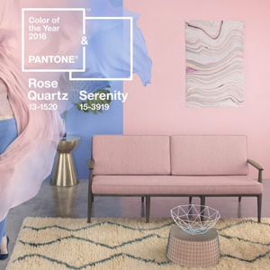
According to Pantone’s announcement, Rose Quartz and Serenity is created to offer just that: Rose Quartz is persuasive, gentle and conveys compassion and composure while Serenity compares to the blue sky and provides relaxation and respite.
With Pantone’s colours of the year, you can bring both an urban and organic design palette to your home. Here’s how:
• Splash Rose Quartz or an ‘Antoinette’ hue (to capture the faded a pink) across a selected wall, but to prevent overkill, scatter with geometric-shaped cushions paired with neutral, clean modern furniture.
• Add modern furniture to pair with the sweet nostalgia of the faded pink.
• If you’re looking more subtlety, add pieces of furniture or miscellaneous decorative objects.
• Find the perfect slumber beneath the gentle tone of Rose Quartz.
• If you’re really committed, splash the palette across a room.