


It is a subtle and warm tone of grown-up pink that draws from the tactile qualities of natural wood and leather, conveying comfort and ease in response to consumers wanting to nestle down more and create a “welcome home”.
The research - conducted by the Dulux colour team, together with a group of 11 international experts, revealed a strong overarching trend of consumers wanting to transform their homes into spaces of retreat from the outside world.
“Colour can play a significant role in addressing the balance between outside clamour and inner calm. We lead such busy lives and sometimes we just need to press pause, relax and recharge and our homes need to provide that kind of environment for us,” says Palesa Ramaisa, Dulux Colour Consultant.
“Our 2018 Colour of the Year truly captures the mood of the moment and its four complementary colour palettes will help consumers achieve a home that is truly and uniquely theirs, bringing a feeling of safety and reassurance, and creating a welcome home for all.”
Make your home your haven
Insights from extensive research into societal, economic and design trends reveal that we live in a world of unpredictability, with access to more information and choices than ever. Now is the time to retreat into the comfort of our homes, where we can turn down the noise and pamper ourselves.
Consumers therefore need their home to provide comfort and be a retreat. By exploring and developing the overarching trend, Dulux identified “Pictured Rocks” as the leading paint colour for 2018.
A place of harmony, comfort and ease for all
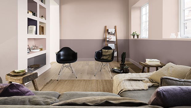
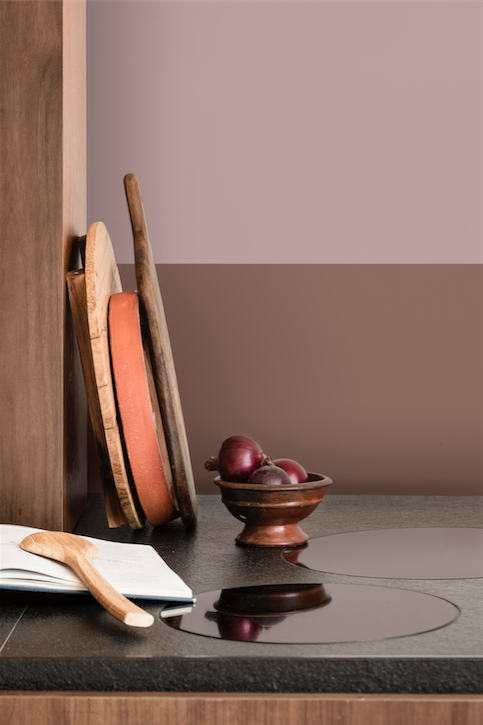
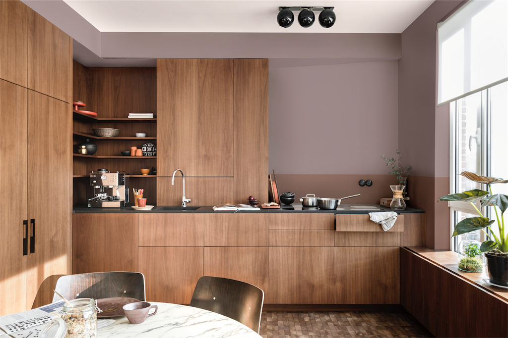
The Welcome Home palette combines gentle shades of grey-pink, blues and soft cocoa flowing into bolder shades of ink blue and purple. It takes inspiration from the tactile qualities of natural wood and the comfort of leather, materials that customers are known to turn to during times of unpredictability. It is calming and restorative and gives a sense of connection between the inside and outside world.
The Welcome Home
The Welcome Home palette blends harmoniously with the materials from which the hero colour, Pictured Rocks, takes its inspiration.The three supporting palettes complement Pictured Rocks, balancing softer shades with deeper, bolder tones. Personas have also been considered, linking them to the different palettes to help us understand the different ways consumers are responding to the current mood of unpredictability.
The Comforting Home
The Comforting Home creates an environment in which to truly recharge and reset the mind. A cocooning space which acts as a restorative embrace. Warm earth tones permeate this home, bringing together clay and blush pink tones to calm the mind, soothe the senses and shut out the noise. Rich, welcoming textures such as silk and velvet create a highly tactile space.
Persona: Looking for a space in which to retreat, this home is perfect for the warm-hearted persona seeking to reconnect with themselves. Using minimal technology, this person brings nature into their home in a controlled way and beautifully balances aesthetics with function in their interior design choices. Comforting hardwoods and tactile textures are staples for them.
The Inviting Home
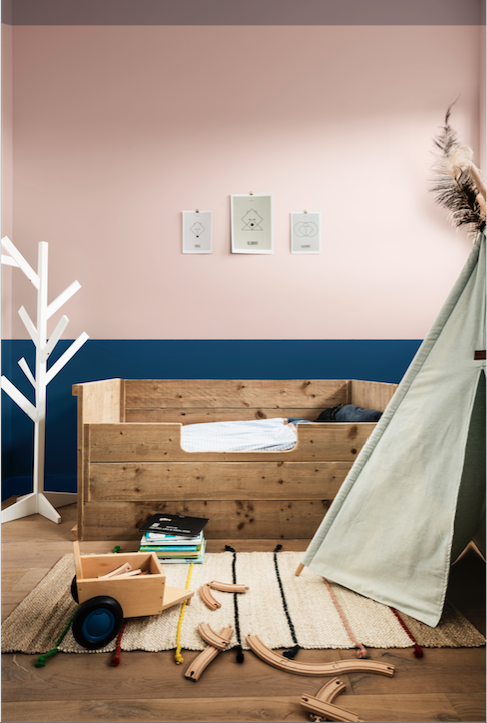
The Inviting Home brings comfort and convenience to life for those seeking to strengthen bonds and bring family and friends together. Cool shades of blue encourage a clear-headed approach to life, while neutrals and fresh green support the need for connection with the outside world. Softer pastel shades are enhanced by coal and ink blue.
Persona: Typically a space for shared quality time, this is perfect for the open-hearted persona. Inclusive, optimistic and collaborative, it’s a space where they can gather with friends and family, bringing comfort through community. Technology is used sparingly and to bring people together in their homes, while the line between the outside and inside is fluid. Open-plan living is at the heart of this home, preferring gentle, hard-wearing natural fabrics that feel safe.
The Playful Home
The Playful Home creates a space to be inspired and invigorate the senses. Yellow-toned green and gold help spark the synapses and encourage a creative approach to life. Pops of colour add a sense of fun and energy, while clever use of color can help create different zones within smaller spaces.
Persona: This home is for the light-hearted persona, curious, adventurous and adaptable. During times of unpredictability, this person looks outwards rather than shutting off and faces the outside world head-on. Early adopters of technology that is seamlessly integrated into their homes, they seek energy, experience and creativity, supplemented by the wealth of time they spend outdoors. Multi-functional, smaller spaces work with natural textures and fun patterns.
Create a true sanctuary with Dulux Colour of the Year
Consumer needs for certain colours ebb and flow with how they feel about the world around them. With the 2018 Colour of the Year and its four contemporary colour palettes, customers around the world can now create spaces within their homes that are truly theirs and up-to date with their everyday needs.
Pictured Rocks (also known as “Nordic Sails 2” instore) is available for purchase from leading paint stores.