Publications
 Partners


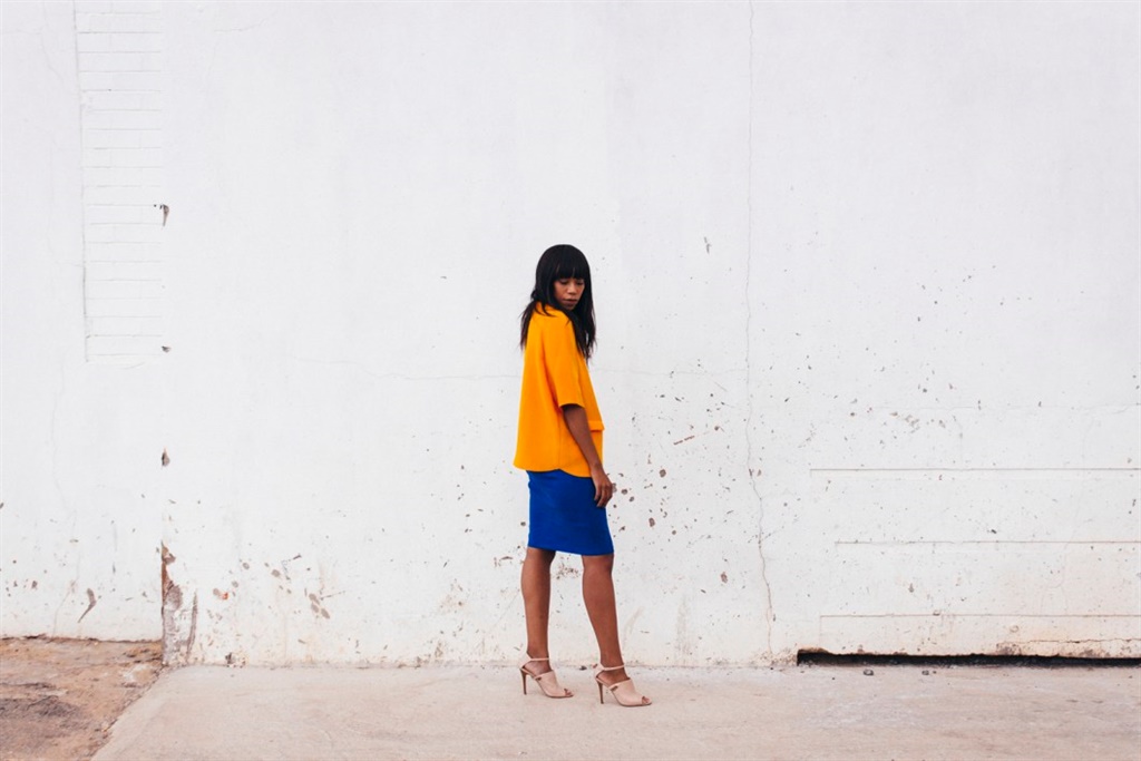
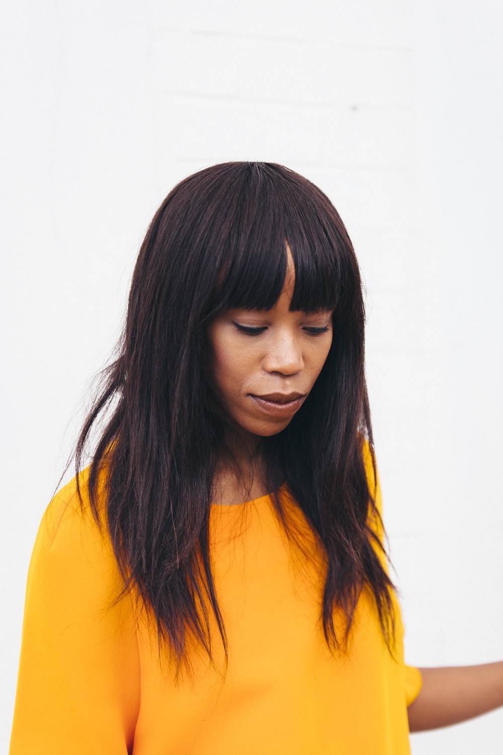
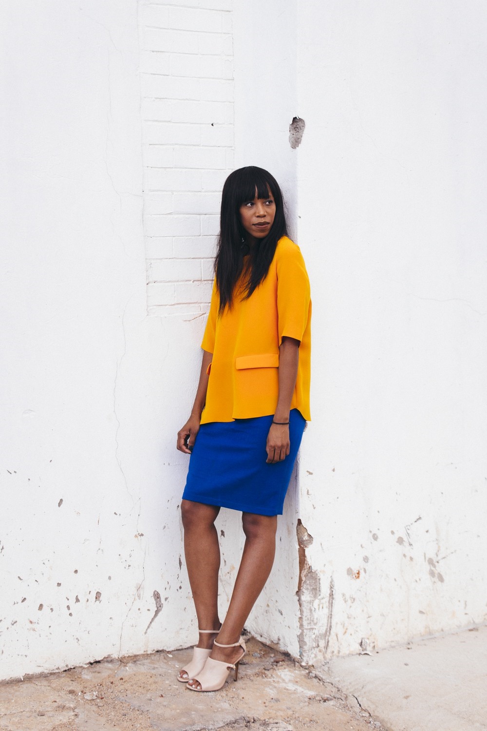
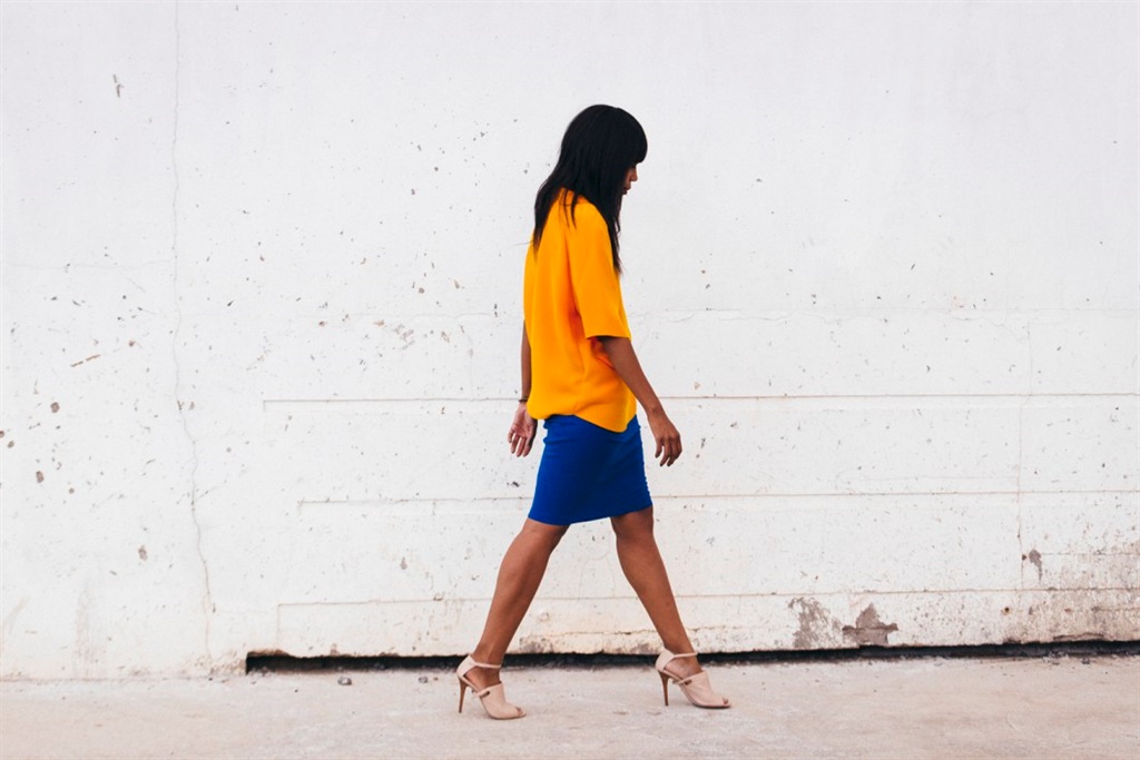
I studied design and I still subconsciously reference the colour wheel. I didn’t realise this until I wore this outfit to an event and everyone commented on how surprisingly well the colours worked together.
In fact, I think most of us do the same thing, but after seasons of minimalist black, white and grey fashion, we have forgotten that colour is amazing and blocking it is even better.
If you look at the colour wheel, colours that complement each other lie opposite each other on the wheel. So red works with green. That’s why Christmas imagery is pleasing to your eyes. Yellow goes with purple and orange goes with blue.
When used together in colour schemes, complementary colours are dynamic and pleasing to the eye. This is because of how the cells in your eye perceive different colours of light.
If you stare for a long time at a block of colour, say red, and then quickly look at a white wall, you’ll see a light afterimage of green. So, next time you're thinking of blocking colours and making a hue rich statement with your outfit, pull out a colour wheel.
Today's look:
Top from Cos at 32 Clothing | Skirt from Max Mara | Heels from Nina Roche at Spitz
Follow Thithi on Instagram or visit her blog.

Photography by Keagan Kingsley Green of Gold Creatures
For more fashion blogger trends:
The only dress you need this summer
The trend: embroidered dresses