Share

Ask the experts: Having issues with your display shelves and hanging art?

accreditation
Share your Subscriber Article
You have 5 articles to share every month. Send this story to a friend!
This site is protected by reCAPTCHA and the Google Privacy Policy and Terms of Service apply.
loading...
Loading, please wait...
0:00
play article
Subscribers can listen to this article
Marian says it’s OK to repeat a visual element; it adds rhythm to your display. Photo: Greg Cox

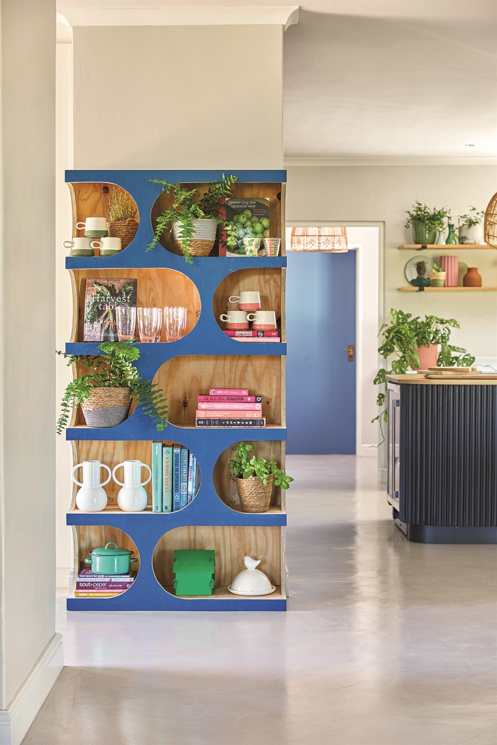
Tasked with styling a kitchen shelf from scratch, our creative editor Marian van Wyk worked her magic from the bottom up. She tells us why, and shares her tips.

Solid and dark at the bottom, light on top
This basic design principle is inspired by nature, where darker colours (soil, grass, tar) are at the bottom, and light colours (blue or grey skies) are at the top.

I placed heavier pieces on the bottom shelf, and glassware higher up.

Read this for free
South Africans need to be in the know if we want to create a prosperous future. News24 has kept the country informed for 25 years, and we're about to enter a new chapter of fearless journalism. Join our free subscription trial to unlock this story and a world of news aimed to inform, empower, and inspire.
Try our free 14-day trial
Already a subscriber? Sign in
heading
description
username
Show Comments ()